aweSOM
aweSOM.RmdThe aweSOM package
aweSOM offers a set of tools to explore and analyze datasets with Self-Organizing Maps (SOM, also known as Kohonen maps), a form of artificial neural network originally created by Teuvo Kohonen in the 1980s. The package introduces interactive plots, making analysis of the SOM easier.
aweSOM can be used either through the web-based interface (called by aweSOM()) or through the command-line functions that are detailed here. The interface also produces reproducible R code, which closely resembles the scripts below.
This vignette details some of the most important functions of the aweSOM package, along with the workflow of training a SOM (using the kohonen package), assessing its quality measures and visualizing the SOM along with its superclasses.
Importing data and training a SOM
For the purpose of this example, we will train a 4x4 hexagonal SOM on the famous iris dataset.
After selecting and pre-processing the training data (here by scaling each variable to unit variance), the somInit function is used to initialize the map’s prototypes. By default, this is done using a PCA-based method, but other schemes are available using the method argument.
The training data, initial prototypes and other parameters are then passed to the kohonen::som function for training. The further training arguments used here are the default ones produced by the aweSOM() interface, based on data and grid dimensions.
full.data <- iris
## Select variables
train.data <- full.data[, c("Sepal.Length", "Sepal.Width", "Petal.Length", "Petal.Width")]
### Scale training data
train.data <- scale(train.data)

### RNG Seed (for reproducibility)
set.seed(31388)
### Initialization (PCA grid)
init <- somInit(train.data, 4, 4)
## Train SOM
iris.som <- kohonen::som(train.data, grid = kohonen::somgrid(4, 4, "hexagonal"),
                         rlen = 100, alpha = c(0.05, 0.01), radius = c(2.65,-2.65),
                         dist.fcts = "sumofsquares", init = init)
Assessing the quality of the map
The somQuality computes several measures to help assess the quality of a SOM.
somQuality(iris.som, train.data)
#>
#> ## Quality measures:
#>  * Quantization error     :  0.258443
#>  * (% explained variance) :  93.5
#>  * Topographic error      :  0.05333333
#>  * Kaski-Lagus error      :  1.43196
#>
#> ## Number of obs. per map cell:
#>  1  2  3  4  5  6  7  8  9 10 11 12 13 14 15 16
#>  7  4 10 11  9  0  8 12 17 15 13 12 16  1 10  5
Quantization error: Average squared distance between the data points and the map’s prototypes to which they are mapped. Lower is better.
Percentage of explained variance: Similar to other clustering methods, the share of total variance that is explained by the clustering (equal to 1 minus the ratio of quantization error to total variance). Higher is better.
Topographic error: Measures how well the topographic structure of the data is preserved on the map. It is computed as the share of observations for which the best-matching node is not a neighbor of the second-best matching node on the map. Lower is better: 0 indicates excellent topographic representation (all best and second-best matching nodes are neighbors), 1 is the maximum error (best and second-best nodes are never neighbors).
Kaski-Lagus error: Combines aspects of the quantization and topographic error. It is the sum of the mean distance between points and their best-matching prototypes, and of the mean geodesic distance (pairwise prototype distances following the SOM grid) between the points and their second-best matching prototype.
Superclasses of SOM
It is common to further cluster the SOM map into superclasses, groups of cells with similar profiles. This is done using classic clustering algorithms on the map’s prototypes.
Two methods are implemented in the web-based interface, PAM (k-medians) and hierarchical clustering. This is how to obtain them in R. In this example, we choose 3 superclasses. We will return to the choice of superclasses below.
Plotting general map information
aweSOMplot creates a variety of different interactive SOM visualizations. Using the type argument to the function, one the following types of plots can be created:
-
Hitmap or population map: visualizes the number of observation per cell. The areas of the inner shapes are proportional to their population.
The background colors indicate the superclasses. The palette of these colors can be adapted using thepalscargument.
aweSOMplot(som = iris.som, type = "Hitmap", superclass = superclasses_pam)- UMatrix is a way to explore the topography of the map. It shows the average distance between each cell and its neighbors’ prototypes, on a color scale. On this map, the darker cells are close to their neighbors, while the brighter cells are more distant from their neighbors.
aweSOMplot(som = iris.som, type = "UMatrix", superclass = superclasses_pam)The aweSOMsmoothdist function can further be used to produce a smooth representation of the U-Matrix. Note, however, that the result representation is biased when using hexagonal maps (the smoothing function coerces the grid to a rectangular shape).
aweSOMsmoothdist(iris.som)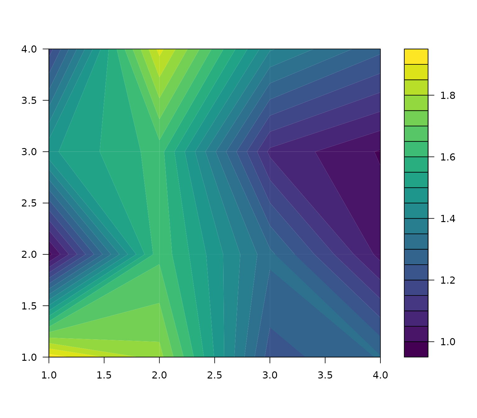
Plotting numeric variables on the map
aweSOMplot offers several types of plots for numeric variables :
- circular barplot
- barplot
- boxplot
- radar plot
- lines plot
- color plot (heat map)
In all of these plots, by default the means of the chosen variables are displayed within each cell. Other choices of values (medians or prototypes) can be specified using the values parameter. The scales of the plots can also be adapted, using the scales argument. Colors of the variables are controlled by the palvar argument.
aweSOMplot(som = iris.som, type = "Circular", data = full.data,
           variables = c("Sepal.Length", "Sepal.Width",
                         "Petal.Length", "Petal.Width"),
           superclass = superclasses_pam)
On the following barplot, we plot the protoype values instead of the observations means.
aweSOMplot(som = iris.som, type = "Barplot", data = full.data,
           variables = c("Sepal.Length", "Sepal.Width",
                         "Petal.Length", "Petal.Width"),
           superclass = superclasses_pam,
           values = "prototypes")
On the following box-and-whisker plot, the scales are set to be the same accross variables.
aweSOMplot(som = iris.som, type = "Boxplot", data = full.data,
           variables = c("Sepal.Length", "Sepal.Width",
                         "Petal.Length", "Petal.Width"),
           superclass = superclasses_pam,
           scales = "same")
On the following lines plot, we use the observation medians instead of the means.
aweSOMplot(som = iris.som, type = "Line", data = full.data,
           variables = c("Sepal.Length", "Sepal.Width",
                         "Petal.Length", "Petal.Width"),
           superclass = superclasses_pam,
           values = "median")
The following radar chart uses the default parameters.
aweSOMplot(som = iris.som, type = "Radar", data = full.data,
           variables = c("Sepal.Length", "Sepal.Width",
                         "Petal.Length", "Petal.Width"),
           superclass = superclasses_pam)
The color plot, or heat map, applies to a single numeric variable. The superclass overlay can be removed by setting the showSC parameter to FALSE.
aweSOMplot(som = iris.som, type = "Color", data = full.data,
           variables = "Sepal.Length", superclass = superclasses_pam)
Plotting a categorical variable on the map
aweSOMplot can also plot categorical variables, using pie charts or barplots.
In this case, we plot the Species of the iris, a factor with three levels, that was not used during training. The following plots show that, based on the flowers’ measures, the SOM nearly perfectly discriminates between the three species.
aweSOMplot(som = iris.som, type = "CatBarplot", data = full.data,
           variables = "Species", superclass = superclasses_pam)
aweSOMplot(som = iris.som, type = "Pie", data = full.data, variables = "Species",
           superclass = superclasses_pam)
By default, the area of each pie is proportional to its cell’s population. This can be changed by setting argument pieEqualSize to TRUE.
Choosing the number of superclasses
aweSOM offers three diagnostics plot for choosing the number of superclasses.
aweSOMscreeplot produces a scree plot, that shows the quality of the clustering (percentage of unexplained variance of the prototypes, lower is better) for varying numbers of superclasses. It supports hierarchical and pam clustering. The rule of thumb is to choose the number of superclasses at the inflection point of this curve.
aweSOMscreeplot(som = iris.som, method = "pam", nclass = 3)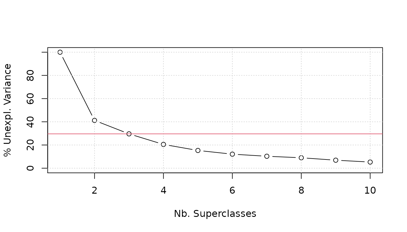
aweSOMsilhouette returns a silhouette plot of the chosen superclasses (hierarchical, pam, or other). The higher the silhouettes, the better.
aweSOMsilhouette(iris.som, superclasses_pam)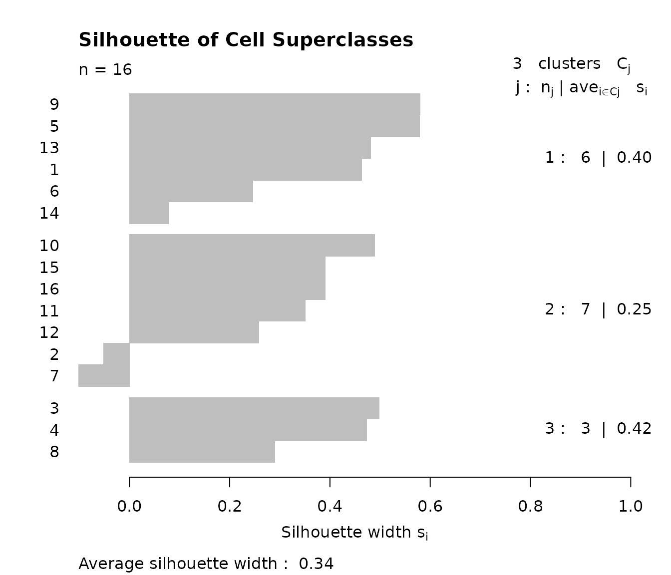
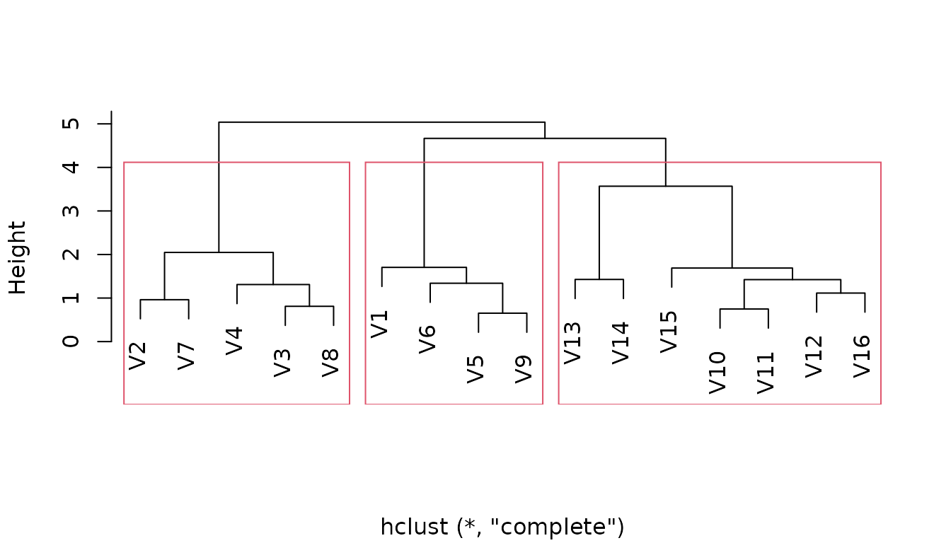
For hierarchical clustering, aweSOMdendrogram produces a dendogram, along with the chosen cuts.
aweSOMdendrogram(clust = superclust_hclust, nclass = 3)